
PIE CHART
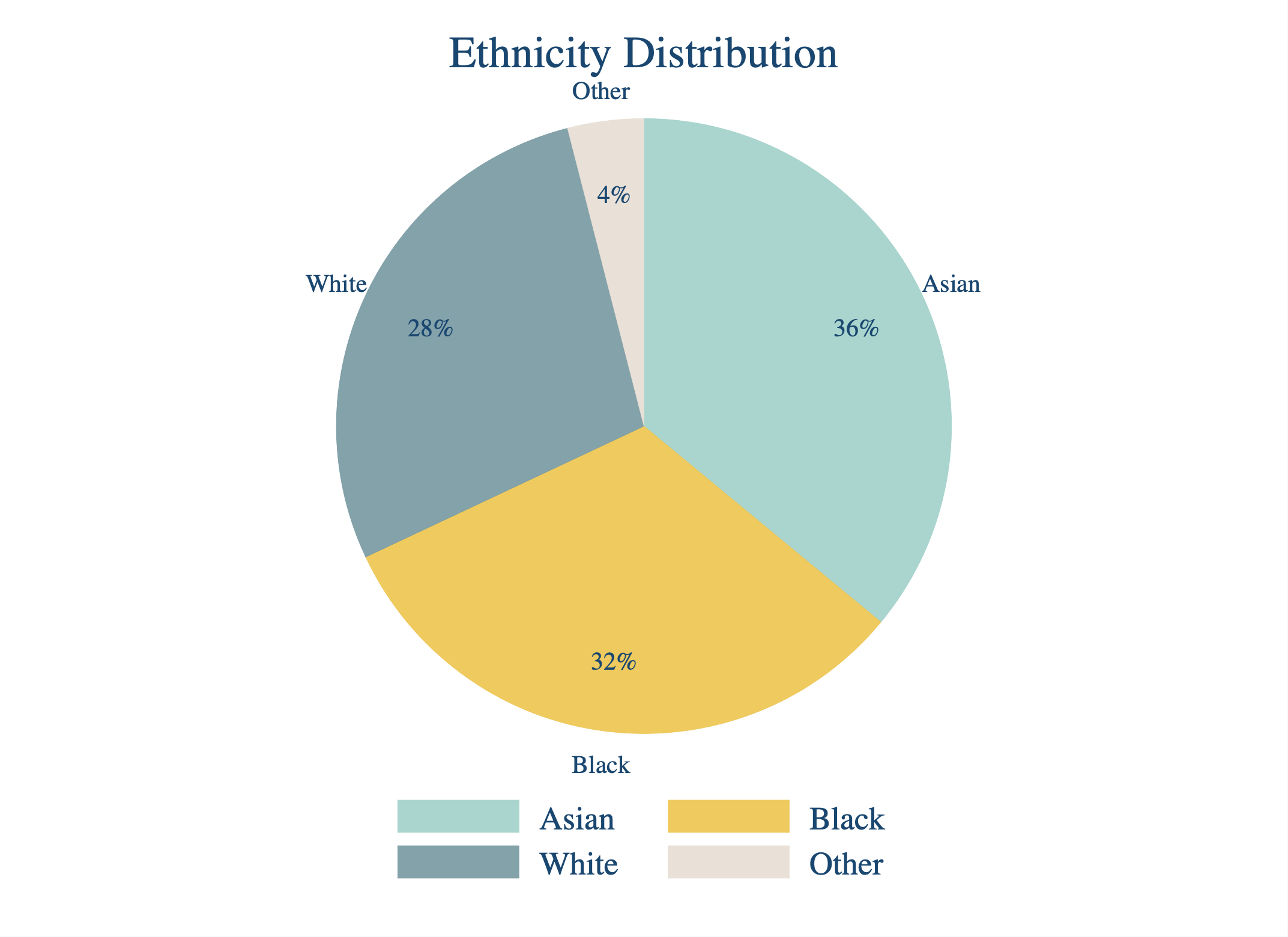
This post is dedicated to preparing a nice-looking STATA pie chart. Since graphing in STATA is not easy, I believe many will find this post useful. The image below shows how your output should look like, and then what follows is the code that was used to prepare it. Before making the graph, please make sure that your data is in the right form (which you can do by browsing the simulated data that my code prepares). Then you can jump to the coding part. The code is broken into pieces, and comments that follow (embedded inside /**/ symbols) explain what each piece of the code is doing. Happy pie-ing!
clear
input ethnicity frequency
1 36
2 28
3 32
4 4
end

la def ethnicitylabel 1 "Asian" 2 "White" 3 "Black" 4 "Other"
la val ethnicity ethnicitylabel

expand frequency

graph pie, over(ethnicity) sort descending ///
pie(1,color("160 208 200")) pie(2,color("236 196 77")) ///
pie(3,color("118 152 160")) pie(4,color("231 222 212")) ///
/*change slice colors using RGB codes*/ ///
plabel(_all percent, color(navy) size(small) format(%2.0f) gap(5)) ///
/*add percentages; in blue color; small size; 0 decimal places; control gap from the center*/ ///
plabel(_all name, color(navy) size(small) gap(22)) ///
/*add labels/names; in blue color; small size; control gap from the center*/ ///
title(Ethnicity Distribution, color(navy) margin(medsmall)) ///
/*add title; in blue color; medsmall size*/ ///
legend(color(navy) region(lcolor(white)) bmargin(medium)) ///
/*add legend; in blue color; white background; add margins around it*/ ///
graphregion(fcolor(white)) ///
/*graph background made white*/