
COEFPLOT
This post shows how to prepare a coefplot (coefficients plot) graph in STATA. In this example, coefplot is used to plot coefficients in an event study, as an intro to a difference-and-difference model, but (a similar code) can be also used in many other contexts as well.
The code below will simulate data on revenues of 100 companies – 50 in the treatment and 50 in the control group – with revenues of the treatment companies realizing an increase after event time (4 in this example).
clear
set obs 100
g id = _n
expand 7
bys id: g t = _n
g treat = id > 50
g revenue = rnormal(10,2)
replace revenue = revenue + rnormal(3,1) if t > 4 & treat == 1
Now, we can run our event study regression that the coefficients plot will be based on. Notice that we set the omitted (base) category to be equal to 4, as that is our event date.
reg revenue ib4.tNow, we can prepare our graph. We keep only the variable t coefficients.
coefplot, keep(*.t)
Now let’s change the orientation of the graph so that the confidence intervals are vertical.
coefplot, keep(*.t) vertical 
Let’s also add the base (omitted) coefficient to the plot as it represents a nice benchmark point (being equal to 0).
coefplot, keep(*.t) vertical base 
Now let’s change the color of the coefficient dots, as well as the color of the confidence intervals. Also, let’s change the name of the coefficients so that date 4 is called “Event time”, and we number the dates before and after the event time from -3 to +3.
coefplot, keep(*.t) vertical base mcolor("106 208 200") ciopts(lcolor("118 152 160")) ///
rename(1.t="-3" 2.t="-2" 3.t="-1" 4.t="Event time" 5.t="1" 6.t="2" 7.t="3")
Next, we will add reference lines crossing both axis: y-axis at 0 and x-axis at event time (4). We also change their color and pattern.
coefplot, keep(*.t) vertical base mcolor("106 208 200") ciopts(lcolor("118 152 160")) ///
	rename(1.t="-3" 2.t="-2" 3.t="-1" 4.t="Event time" 5.t="1" 6.t="2" 7.t="3") ///
	yline(0,lcolor("106 208 200") lpattern(dash)) xline(4, lcolor("236 196 77"))
Now let’s make the graph background color white.
coefplot, keep(*.t) vertical base mcolor("106 208 200") ciopts(lcolor("118 152 160")) ///
	rename(1.t="-3" 2.t="-2" 3.t="-1" 4.t="Event time" 5.t="1" 6.t="2" 7.t="3") ///
	yline(0,lcolor("106 208 200") lpattern(dash)) xline(4, lcolor("236 196 77")) ///
	graphregion(fcolor(white) ifcolor(white) ilcolor(white))
Change the colors of the axis lines.
coefplot, keep(*.t) vertical base mcolor("106 208 200") ciopts(lcolor("118 152 160")) ///
	rename(1.t="-3" 2.t="-2" 3.t="-1" 4.t="Event time" 5.t="1" 6.t="2" 7.t="3") ///
	yline(0,lcolor("106 208 200") lpattern(dash)) xline(4, lcolor("236 196 77")) ///
	graphregion(fcolor(white) ifcolor(white) ilcolor(white)) ///
xscale(lcolor("0 51 102")) yscale(lcolor("0 51 102")) 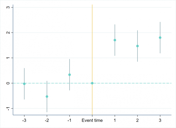
Change the colors of the axis labels, and also remove the ticks and gridlines.
coefplot, keep(*.t) vertical base mcolor("106 208 200") ciopts(lcolor("118 152 160")) ///
	rename(1.t="-3" 2.t="-2" 3.t="-1" 4.t="Event time" 5.t="1" 6.t="2" 7.t="3") ///
	yline(0,lcolor("106 208 200") lpattern(dash)) xline(4, lcolor("236 196 77")) ///
	graphregion(fcolor(white) ifcolor(white) ilcolor(white)) ///
	xscale(lcolor("0 51 102")) yscale(lcolor("0 51 102")) ///
	xlabel(, labcolor("0 51 102") noticks) ylabel(, labcolor("0 51 102") noticks nogrid)
Finally, add a title to the graph.
coefplot, keep(*.t) vertical base mcolor("106 208 200") ciopts(lcolor("118 152 160")) ///
	rename(1.t="-3" 2.t="-2" 3.t="-1" 4.t="Event time" 5.t="1" 6.t="2" 7.t="3") ///
	yline(0,lcolor("106 208 200") lpattern(dash)) xline(4, lcolor("236 196 77")) ///
	graphregion(fcolor(white) ifcolor(white) ilcolor(white)) ///
	xscale(lcolor("0 51 102")) yscale(lcolor("0 51 102")) ///
	xlabel(, labcolor("0 51 102") noticks) ylabel(, labcolor("0 51 102") noticks nogrid) ///
	title(Coefplot (Event Study) Graph, color("0 51 102"))